
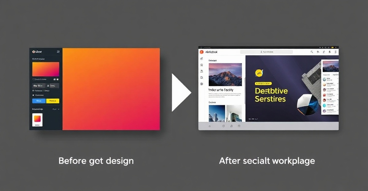
From Good to Great: Polish Your Design
A template gives you a strong foundation, but what separates amateur work from professional design is attention to detail. Let’s explore the practices that take your template from functional to memorable.
1. Establish Visual Hierarchy
The Rule: Most important information should be most visible.
- Size: Make headlines and CTAs noticeably larger
- Color: Use accent colors sparingly to draw attention to key elements
- White Space: Don’t overcrowd. Empty space is a design tool, not wasted space
- Position: People scan left-to-right, top-to-bottom. Place important elements accordingly
2. Typography That Speaks
Avoid These Common Mistakes:
- Using more than 2-3 typefaces (confusing and unprofessional)
- Tiny text that requires zooming (bad UX)
- Contrast that’s too low (hard to read)
- Inconsistent font sizes across similar elements
Best Practices:
- Use generous line-height (1.5x minimum) for readability
- Maintain consistent font sizes for elements of the same type
- Choose typefaces that reflect your brand personality
- Test readability at different screen sizes
3. Color Consistency and Psychology
Develop a Clear Palette:
- Primary color (your brand color—use sparingly)
- Secondary color (supports primary)
- Neutral colors (backgrounds, text)
- Accent color (highlights, CTAs)
Color Psychology:
- Blue conveys trust and professionalism
- Green suggests growth and health
- Red drives urgency and action
- Yellow creates optimism and warmth
Never use more colors than your palette defines. Consistency strengthens brand recognition.
4. Spacing and Alignment
The 8px Grid System: Using a consistent grid (8px, 16px, 24px, etc.) creates invisible structure that feels organized. Align all elements to this grid.
Breathing Room: Don’t cram elements together. Space between sections improves readability and feels more premium.
Responsive Spacing: Increase spacing on larger screens, decrease on mobile. This maintains visual balance across devices.
5. Imagery That Works Hard
Quality Over Quantity: One professional, relevant image beats ten mediocre stock photos.
Optimization: Compress images without quality loss. Slow-loading images hurt both UX and SEO.
Consistency: Use a consistent image style (all photos, all illustrations, all abstract). Mixed styles feel disjointed.
Authentic Representation: Generic stock photos feel cheap. If possible, use real product shots or custom illustrations that reflect your actual business.
6. Interactive Details (Micro-interactions)
These small animations add polish:
- Hover states: Buttons that change on hover show interactivity
- Smooth transitions: Fade-ins feel more refined than instant changes
- Loading states: Show users something is happening
- Feedback animations: Confirm when users complete an action
These details aren’t frivolous—they improve perceived quality and user confidence.
7. Accessibility Matters
Color Contrast: Ensure 4.5:1 contrast ratio for text (WCAG AA standard minimum)
Font Sizes: 16px minimum for body text (increases readability and accessibility)
Clear Labels: Form fields need visible labels, not just placeholder text
Keyboard Navigation: All interactive elements should be keyboard accessible
Accessible design isn’t altruistic—it’s good business. You reach more people and improve UX for everyone.
8. Consistency Across Pages
Create a Style Guide: Document your spacing, typography, color usage, and component styles. This ensures consistency and makes scaling easier.
Template Components: Use template sections repeatedly (cards, testimonials, CTAs). Repetition feels intentional and professional.
Branding Elements: Every page should immediately feel like it’s part of the same product through consistent branding elements.
Practical Workflow
- Audit: Examine every page and element. Is the hierarchy clear? Are colors consistent?
- Refine: Increase spacing, improve contrast, adjust sizing
- Polish: Add subtle hover effects and transitions
- Test: Check on mobile, tablet, and desktop. Have others review it
- Iterate: Small improvements compound into major polish
The Polishing Mindset
Professional design isn’t complicated—it’s consistent attention to detail. Small refinements in spacing, typography, and color create an experience that feels premium and trustworthy.
Challenge: Pick one page and apply these best practices. You’ll see the immediate impact on perceived quality. Then apply the same approach to your entire site.